Sailing Through the Space Age with Futura
If a year ago, you'd told me that one of the best times I'd ever have in my life was creating typographic posters for Futura, I would have certainly given you some major side-eye. Flash forward twelve months and I'm on a legit letterform high, making craziness happen across dozens of artboards and loving every moment of it. Type nerds are up there with drama and band kids...and until recently, I did not believe I was one of them.
I wouldn't dare whisper a bad word about Helvetica, but FUTURA. People—Futura! It's the crack of the typographic world, and I knew I had to get my hands on it for my type class's poster assignment. It's a little unfair, perhaps, that I pounced on Futura before anyone else had the chance to. But I knew that we were meant to be together. And nothing stops true love.
Like photographing Greece this summer, it's hard to make anything terrible when you have such fabulous raw material to work with. For our assignment, we had to include the name of the typeface, the full alphabet, the designer's name, and a short paragraph or two about it. Though the point of the piece wasn't so much to read the copy we dug up on the internet, I must say (literary maven that I am), I did find an excellent description of Futura on Slate.com, which I edited down to:
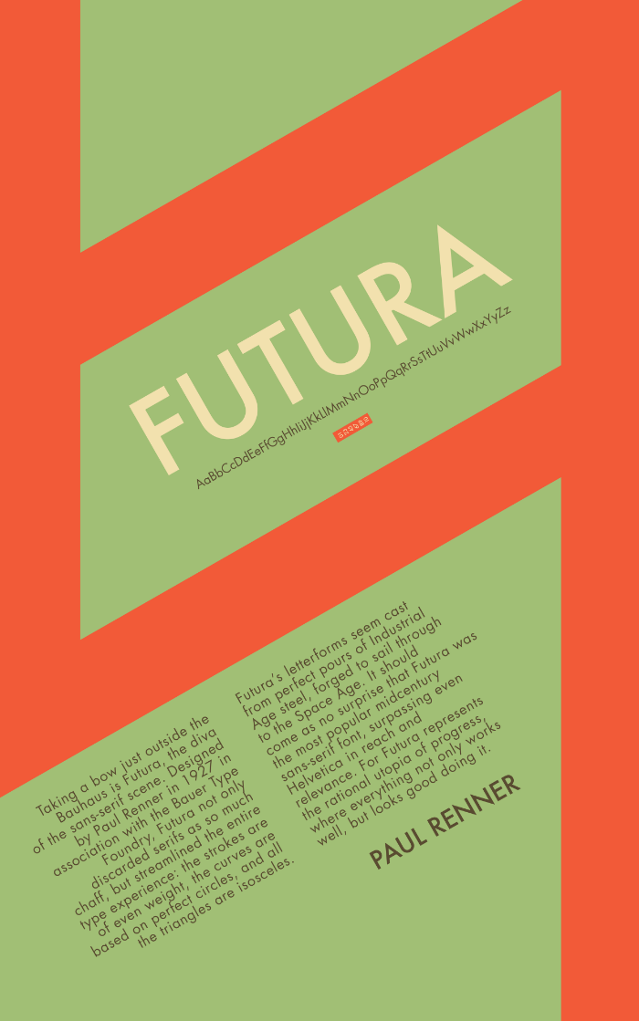
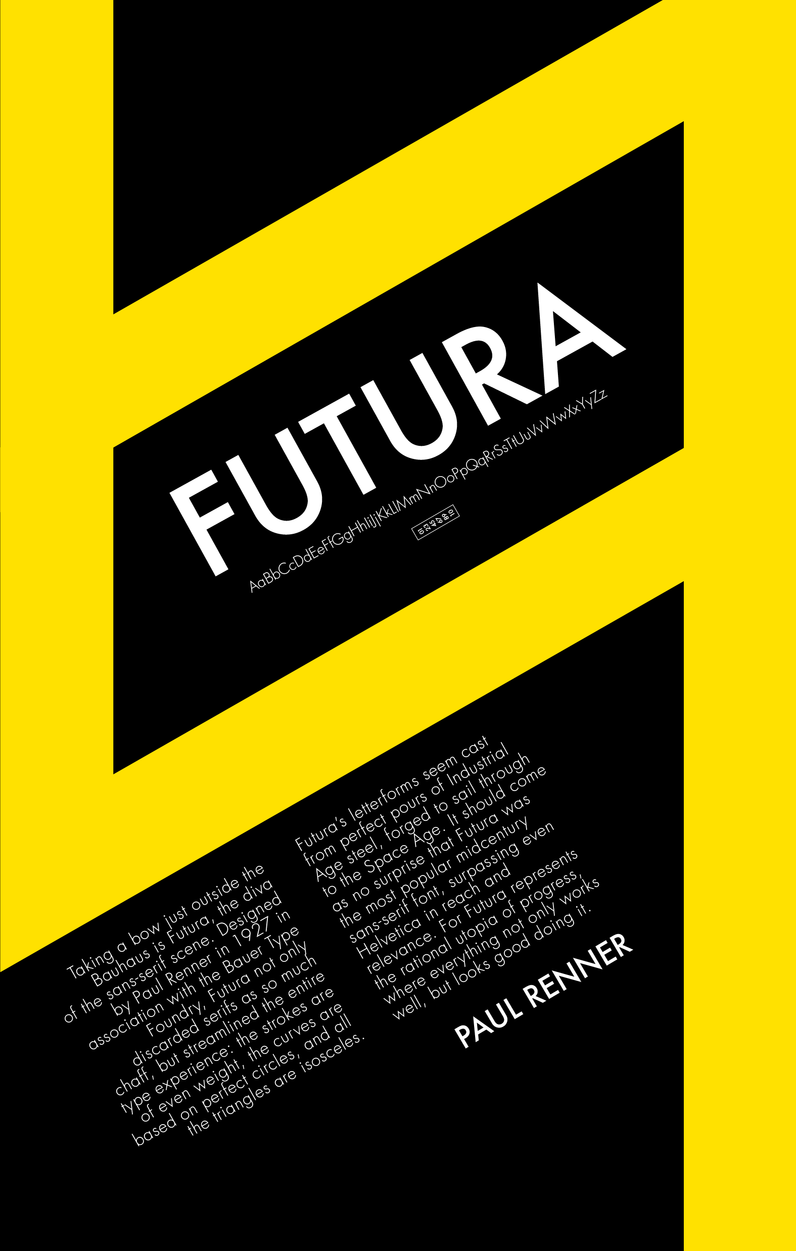
Taking a bow just outside the Bauhaus is Futura, the diva of the sans-serif scene. Designed by Paul Renner in 1927 in association with the Bauer Type Foundry, Futura not only discarded serifs as so much chaff, but streamlined the entire type experience: the strokes are of even weight, the curves are based on perfect circles, and all the triangles are isosceles. utura’s letterforms seem cast from perfect pours of Industrial Age steel, forged to sail through to the Space Age. It should come as no surprise that Futura was the most popular midcentury sans-serif font, surpassing even Helvetica in reach and relevance. For Futura represents the rational utopia of progress, where everything not only works well, but looks good doing it.
Such a good quote it is that I had to make not one, but two final versions of my poster:
Of course, I played and played, then played some more:
In the end, the classroom was crazy about the "pistachio" versions, and I had to agree.
Do I have a little bit of a Wes Anderson obsession? Yes. Have I used Futura (bold and light, of course...and well, medium, too...) for practically everything I've designed since creating these? Yes. Do my feelings get confused when I see Avenir and really like it, but realize it's missing that je ne sais quoi? All the time. (I really REALLY love Avenir too, since we're talking emotions here.)
But my loyalties are set. Helvetica, I like you. But Futura, this is love. We were meant to be together for eternity. ♥ ♥ ♥


